• About
  • Portfolio
  • Studio
  • At Home
  • On Location
  • Portfolio 2015
  • Portfolio 2016

Ruud van Gaal

~ Photography

Ruud van Gaal

Category Archives: postprocessing

Dark

15 Sunday Dec 2019

Posted by Ruud van Gaal in photography, postprocessing, studio

≈ Leave a comment

Tags

dark, jewelry, longhair, lowkey, studio

When shooting on a gray background, the nice thing is it is easily detachable in Photoshop to subtly adjust. Here I went for quite a bit of subtle post-processing : ProRetouch from Totally Rad (not affiliated but I love their subtle actions), then in the second pass a Sean Archer action. The latter gives some subtle extra lights and less smooth background (actually requiring you to more or less shoot on a 50% gray backdrop) . With lovely model Simone.

IMG_1837b_colFB

Post processing workflow

10 Saturday Feb 2018

Posted by Ruud van Gaal in photography, postprocessing, tips

≈ Leave a comment

Tags

post, postprocessing, tutorial

When post-processing photos, not all of them require the same steps. But still, I’m following these steps roughly every time I edit a picture. Note that the workflow changes somewhat over the years as I learn new things, or just get new tools, or my style changes.

  • Take pictures in RAW. RAW gives you more bits to play with (at least 12 bits), where JPEG only supports 8 bits. Each bit is a two-fold improvements, so from 8 to 12 bits gets you 2*2*2*2 = 16x more levels for each color.
  • Use a tablet. This might be preferences, because I’ve done pencil drawing in the past, and generally like the feel of painting/drawing. Making physical contact with something that feels like it has structure feels so much more creative than using a mouse to move a pointer.
  • Open the image in Adobe Photoshop, first making slight adjustments in the RAW import for exposure so you use the RGB range optimally. Use the histogram to check that roughly. I sometimes underexpose a little, especially under varying lights conditions, since (with digital photography) it’s easier to get back detail in shadows than to get back details in highlights.
    Also I check the white balance and correct that a little bit so it looks relatively natural (although I often tend a little to the warm side, so higher temperatures).
  • The first step (packed into an action) is to duplicate the original. This allows you to always compare the edits to the original photograph.
  • Use the spot healing brush to blot out imperfections. There is also the clone stamp which many people use, and while that gives slightly better results, I hardly ever use it, as the spot healing brush does the job nice enough for me. I change the size of the brush around to be slightly larger than the spots I correct (use the [ and ] keyboard shortcuts to work quickly).
  • Duplicate the layer (Ctrl-J) and use Liquify (Ctrl-Shift-X). Optionally increase the hair size (a trick I learnt from Irene Rudnyk; she works super-destructively but the end result is still great).
  • Next is skin retouching; I usually use Totally Rad’s ProRetouch v2.0 for that. A pass of ‘Skin: Foundation Strong’ and ‘Skin: Magic Eraser’. The first reduces contrast and does slight blurring, the 2nd one more blurring. Applying this gently through masks allows retouching of the skin without overdoing it.
    The first filter does take away some of the highlights, which we’ll bring back later on with dodging and burning.
  • Next is that dodging and burning; I create 2 curves layer; one which lightens everything up (just drag a center point up slightly) and another which darkens things. I add an empty mask so initially both layers have no effects (I have wrapped all this in an action for speed). Then I start adding in highlights and shadows with a soft 20-30% brush. With the shadows I accentuate the cheekbones mostly, and adding some depth to some shaded areas. Sometimes when some body parts are lighter than the face, I used the shadow curve adjustment layer to reduce that in brightness as well. It can be used to make the makeup around the eyes slightly darker too, to enhance the size of the eyes.
  • Then I do a pass on the eyes; 3 aspects really. First is the sharpness; I add some sharpness to the eyes to make them pop out a bit more. I also use the same layer often to sharpen the eyebrows a bit, plus the lips.
    2nd is using a soft white brush in a layer set at ‘Soft Light’ to brighten up the irises. Since I like adding contrast in post, the eyes can get too dark otherwise.
    Note that irises are located at depth inside the eye, so add brightness at the opposite sides of the lights. If the light comes from above, add brightness at the bottom of the iris. If the light comes from the left, add brightness at the right side of the iris (as seen from the monitor, not from the model).
    The 3rd is an optional paint layer where I reduce bags under the eyes by painting over a lighter color. Like with every layer you have to be really careful to apply the right amount. On the other hand, this is where your style is visible and some may like it more natural, others more over the top.
  • Before color grading I sometimes add extra punch to the hair, for example using RadLab’s ‘Hair: Brunette Shine’ action.
  • Last comes color grading, or conversion to black & white. This has varied over the years. I sometimes do a conversion to a Smart Object on which I can apply effects from the Nik Pro collection. Lately I’ve been using simpler LUTs from IWLTBAP.
    It’s a mix now really between LUTs that are masked, a color balance layer to adjust some parts of the image.

I’ve been writing this flow when doing the picture shown below. Hope this is of any use to you. 🙂

before_after

Rembrandt

30 Friday Dec 2016

Posted by Ruud van Gaal in photography, postprocessing, studio

≈ Leave a comment

Tags

filters, paint, rembrandt, spot, symmetry

Here is an image from Ella. Her clothing and the lighting here matched to resemble a bit the painting of the old days. It’s a bit of Rembrandt lighting, although perhaps the triangle on her right cheek (left in the image) is a bit too big for that. And the blue spotlight in the back is perhaps a bit much for a 17th century look.

I used a lot of layers for this one, which is bad in a way since I’m always editing in 8 bits, so every layer you add will hurt the resolution of your colors. In the end, noise is always an answer for that to cover up some of the banding you add while trying to compromise the 16 vs 8 bits differences between speed, disk space and accuracy.

There is the usual blemish removal, a bit of eye lightening (though this girl really has very reflective eyes and large pupils). Then some 3D color lookups towards the CandleLight cube to get a more painterly color space. Some lifting of the black colors to get a bit of a washout effect (note that this is oh so delicate, depending on which screen you’re looking). Some noise, and a gentle crackle effect that I used once in the past to mimic old paint.

I love the simplicity, the strongness of her look and the old-fashioned post-processing.

img_6462_colfb

Double Exposure

19 Saturday Mar 2016

Posted by Ruud van Gaal in photography, postprocessing, tips

≈ Leave a comment

Tags

bw, chanelle, doubleexposure

I recently tried a bit of the double-exposure effect. This works quite effectively when using two silhouette type images. I wanted to start out with this photo though:

IMG_6757_org_colFB

That took a bit of photoshopping to invert. Then I took a smartphone shot I took while running of a tree near my home and put that on top. The basic idea is to have a regular background image (the head in this case) and overlay the other silhouette image above that and change the layer blending mode to ‘Screen’.

In practice, I used quite a bit of masking to get the effect constrained to the areas I wanted to. This is what I ended up with:

IMG_6757_bwFB

Thanks to Chanelle for posing in the original image!

Weathering the storm

10 Thursday Dec 2015

Posted by Ruud van Gaal in photography, postprocessing, studio

≈ Leave a comment

Tags

color grading, felicia, indoor

Now & then I just have to mess with the background. 😉

This one was originally very clean; I added a soft vignette, then as I tried to add a light area coming from the left, my brush misbehaved and there were spots and larger areas and it all turned out a bit cloudy, Christmassy. I added a wee bit of rain (if that comes through after the compression), drove most of the image towards blue and raised the lightness to get rid of the black and insert some floaty feeling to match the cloudy background.

I like it, it’s dreamy. I like dreamy.

Mystery Woman

Colors

18 Wednesday Nov 2015

Posted by Ruud van Gaal in photography, postprocessing

≈ Leave a comment

Tags

annemiek, hair, lips, lipstick

This one is another one from Annemiek, postprocessed to get a white vignette at the bottom, and some coloring on the sides.

Colors

Color grading

24 Saturday Jan 2015

Posted by Ruud van Gaal in postprocessing, tips

≈ Leave a comment

Tags

color grading

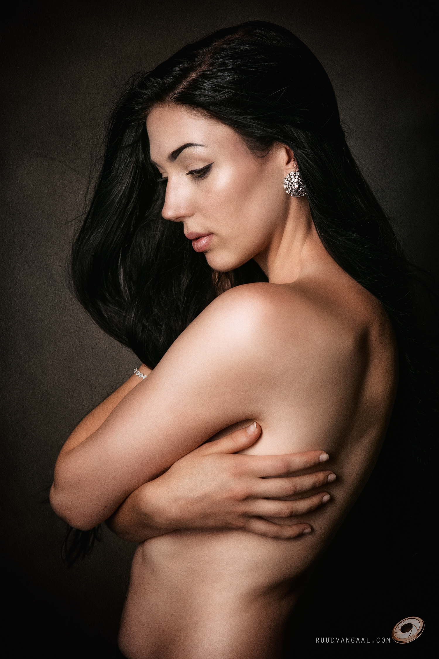
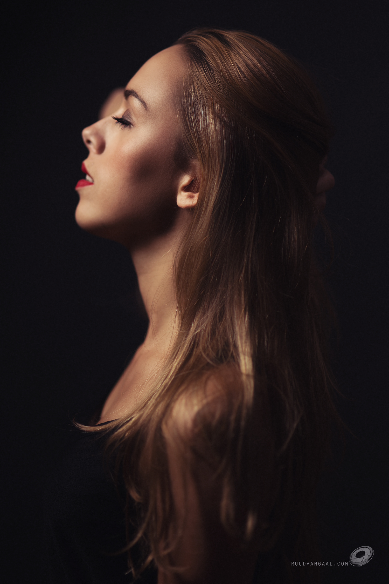
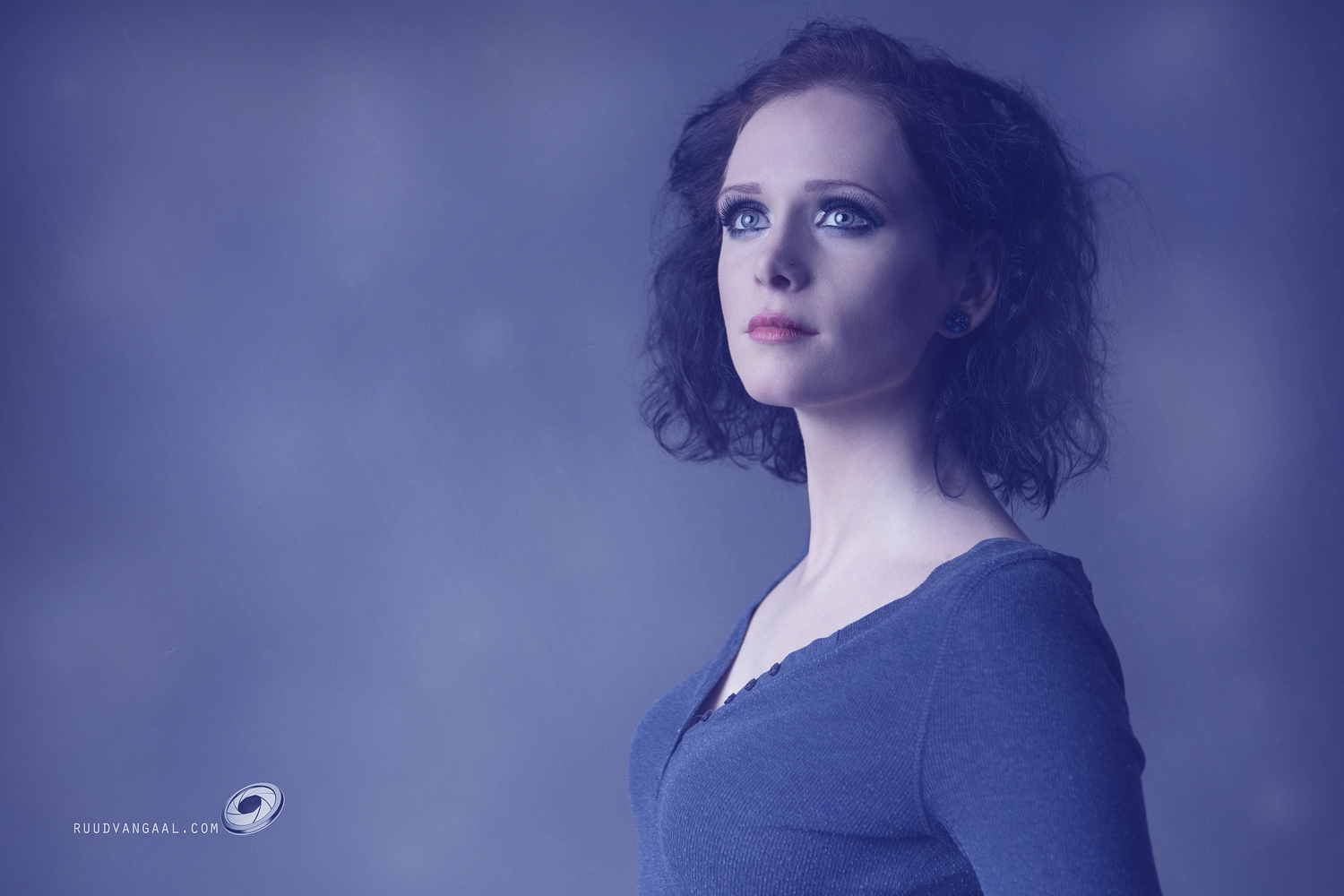
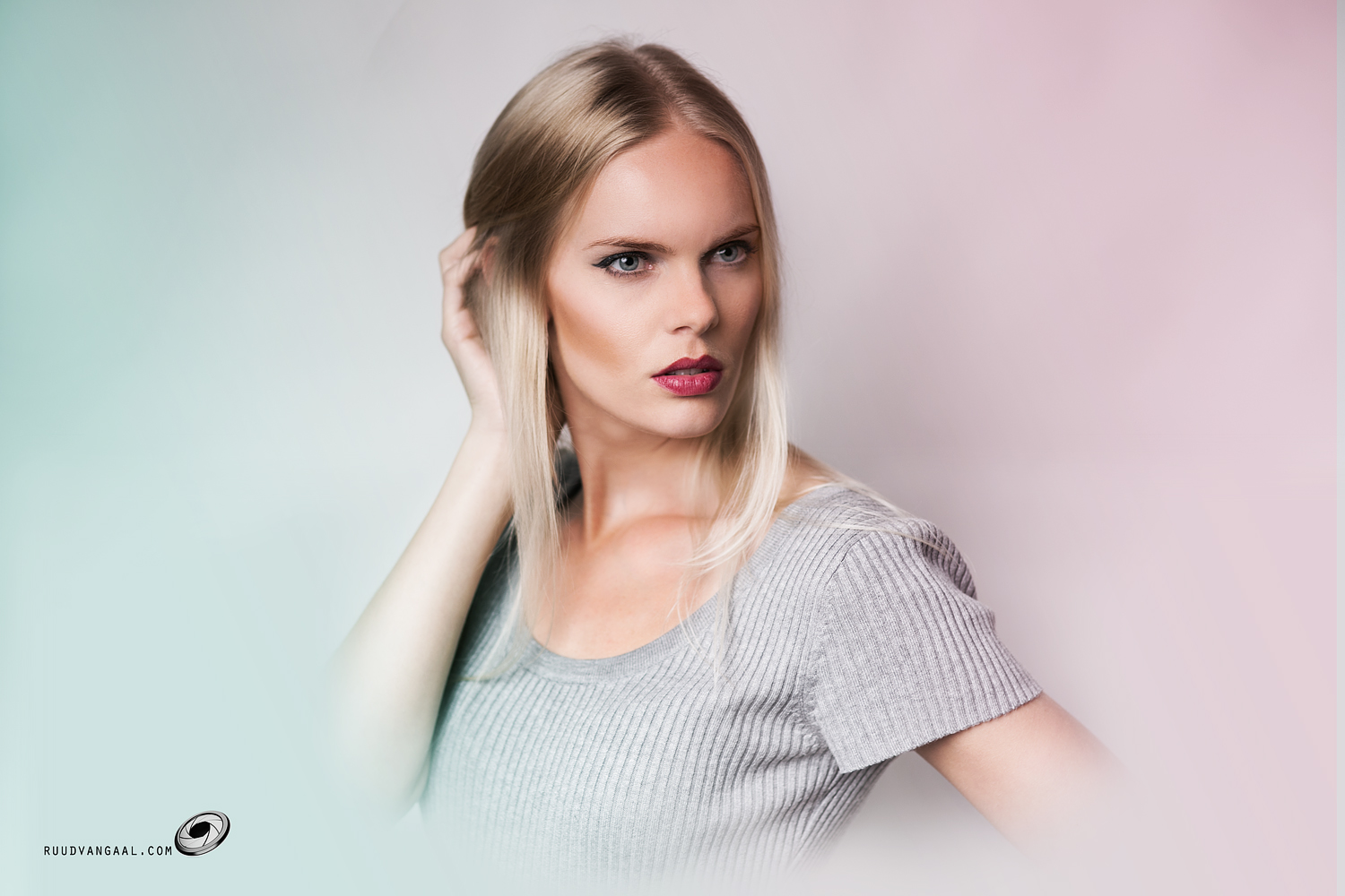
While shooting, I never actually add a white balance type shot featuring a color reference card (such as an X-Rite Color Checker). Though these may be helpful when trying to get back a lighting situation if you shoot over more than one day (since you may have trouble getting lighting to match), I’ve never been too interested in achieving a perfect true-to-life color balance.

When post-processing photos from my shoots, I always do my processing in the original white balance, which should be close to real-life. At the end though, I always add some color grading to purposely add some colorizations to the image. I think it just looks cooler (pun not intended; I often warm the image up in fact 😉 ).

An added step also is to add some drama; I have an action which simply does this:
– add a Black & White adjustment layer;
– set that layer’s blending mode to Overlay;
– add a layer mask.

I lower the opacity of the entire drama layer first, to match the most dramatic part of the image, and then I refine it using a mask.

As an example, look at the following two images; the first is the original, the 2nd has a Black & White adjustment layer added at 100%. It’s a simple method and often a mask is needed to avoid drowing shadowy areas such as the eyes, but it’s a simple technique to add some punch to your photos.

IMG_7241IMG_7241_drama

Color grading itself could be an entire study. An interesting video that explains it for film is at http://vimeo.com/65617394

In Photoshop though, an always-interesting Phlearn tutorial shows how to do things in Photoshop; see http://phlearn.com/how-to-apply-cinematic-color-grading-to-your-photos

These two videos are a great introduction to learn more about bending your colors in Photoshop, to give a more special mood to your images.

Follow Ruud van Gaal on WordPress.com

Archives

  • March 2020 (1)
  • February 2020 (3)
  • January 2020 (2)
  • December 2019 (2)
  • November 2019 (1)
  • October 2019 (1)
  • July 2019 (1)
  • April 2019 (2)
  • March 2019 (2)
  • February 2019 (1)
  • November 2018 (1)
  • August 2018 (1)
  • July 2018 (1)
  • June 2018 (1)
  • May 2018 (1)
  • March 2018 (2)
  • February 2018 (1)
  • January 2018 (1)
  • December 2017 (1)
  • November 2017 (1)
  • October 2017 (2)
  • August 2017 (2)
  • June 2017 (1)
  • May 2017 (2)
  • April 2017 (2)
  • March 2017 (3)
  • December 2016 (6)
  • November 2016 (3)
  • October 2016 (4)
  • August 2016 (10)
  • July 2016 (7)
  • June 2016 (9)
  • May 2016 (5)
  • April 2016 (4)
  • March 2016 (7)
  • February 2016 (11)
  • January 2016 (6)
  • December 2015 (12)
  • November 2015 (12)
  • October 2015 (14)
  • September 2015 (3)
  • August 2015 (4)
  • July 2015 (7)
  • June 2015 (6)
  • May 2015 (7)
  • April 2015 (11)
  • March 2015 (18)
  • February 2015 (13)
  • January 2015 (7)
  • December 2014 (4)
  • November 2014 (7)
  • October 2014 (1)

Categories

  • home (8)
  • outside (20)
  • photography (234)
  • postprocessing (7)
  • studio (96)
  • tips (7)
  • travel (2)

Blog at WordPress.com.

Privacy & Cookies: This site uses cookies. By continuing to use this website, you agree to their use.
To find out more, including how to control cookies, see here: Cookie Policy
  • Follow Following
    • Ruud van Gaal
    • Join 104 other followers
    • Already have a WordPress.com account? Log in now.
    • Ruud van Gaal
    • Customize
    • Follow Following
    • Sign up
    • Log in
    • Report this content
    • View site in Reader
    • Manage subscriptions
    • Collapse this bar
 

Loading Comments...