In my studio, I have a fairly standard Manfrotto 3-bar background paper setup, where I can easily roll on or off three different colors of background paper.
Throughout the years, I’ve moved from using colored backgrounds, such as red and blue, towards gray tones. I ended up a month or so ago with black, white and a light gray. Now, I’ve moved out the white background. Why? It seems I often find the white background unnecessarily white, and can use the slightly darker gray as well.
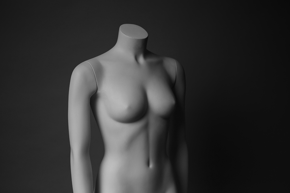
Below are three shots, starring my trusty bodypainted bust (thanks to Belinda for the bodypaint, so it actually has a skintone color instead of being flashing white!). The top color is the light gray (Savage Slate Gray), the bottom color is Savage Smoke Gray.

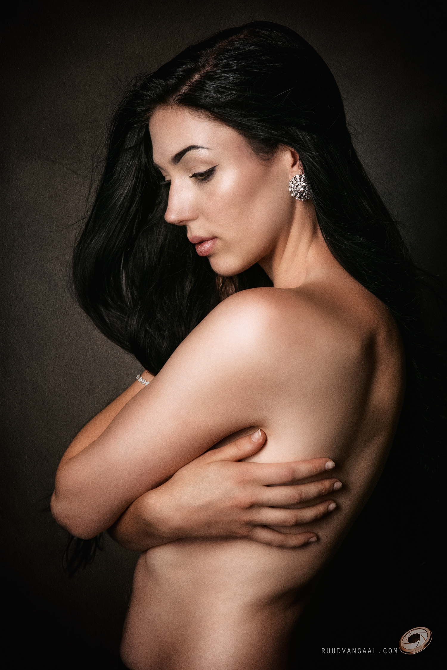
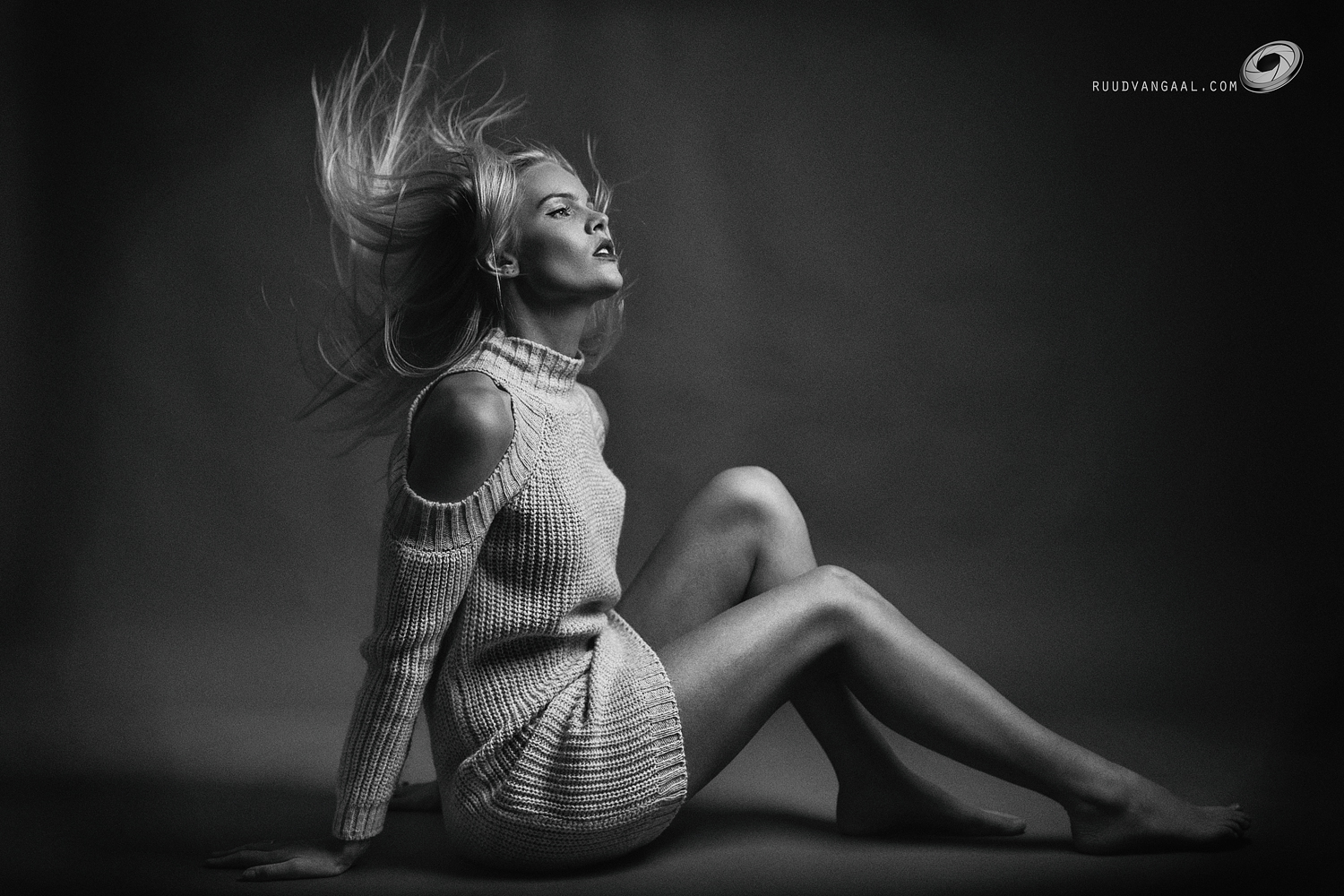
Although it still looks kind of dark, I noticed while shooting with actual people and actual shots that the skintone of people quite nearly matched that of the background (in light areas of skintone). I often like the background to be darker though, so that the entire body stands out. With the light background, I can simulate white now, since it’s already quite light. With the darker Smoke Gray, I can go a step further, making moody images without going full-on with a black background paper.
Here is a shot with the light Slate Gray. Note that here things appear a little darker than with actual human subjects (unfortunately).

And a shot with the darker gray, Smoke Gray. This gives more contrast, without really going towards black. I know, you can get black by moving the subject away from the background, but my studio is not that large and I like a bit of shadow to get a bit of 3D feel.

I should redo this test with an actual model probably. But for now, I have the three colors light gray (slate), smoke gray and black hanging. Looking forward to the next shoot to try it out!